QUESTION
Discuss the different between bitmap and vector
graphics. Describe 5 different graphic elements you might use in a project, for
example, the background, buttons, icons, or text. Would you use a vector tool
or a bitmap tool for each element? Why?
Difference Between Raster and Vector Graphics
 2. Raster or bitmap images are always rectangular in shape. If you see a bitmap image with any other shape then it just means that the rest of the pixels have same color as the image’s background color. Vector images, however, can have any shape. For example, see the image here. The vector bitmap and the vector circle seems to be the same on a white background. However, on any other color, the difference is obvious as the bitmap circle’s white pixels are visible, thus proving its rectangular shape.
.jpg)
.jpg)

Designing Button Graphics

 Identify and understand the way that your target platforms handle colors at different bit depths. To achieve your desired effect, test your graphics on all target platforms at depths less than 16 bits.
Designing Graphics in the Java Look and Feel Style
ll>Use the GIF file format for iconic and symbolic graphics. It usually results in a smaller file size
than the JPEG format and uses loss-less compression.
ll>Put all application graphics in resource bundles.
ll>Where possible, use globally understood icons, button graphics, and symbols. Where none exist,
create them with input from international sources. If you can't create a single symbol that
works in all cultures, define appropriate graphics for different locales (but try to minimize this task).
ll> Vector masking is one of many useful features in Fireworks, but the program's greatest strength comes from its demolition of the traditional line between vector and bitmapped graphics. Having both kinds of tools available in one program is convenient, but being able to combine and harmonize them in new and unexpected ways opens a lot of creative doors. Fireworks allows you to change the way you design with old familiar and comfortable tools.
1. Raster or Bitmap images are resolution dependent. because of this its not possible to increase or decrease their size without sacrificing on image quality.
When the size of a bitmap or raster image is reduced, some pixels must be thrown away. Thus loosing some of the image’s data. When you increase its size, some new pixels must be created based on the color values of the surrounding pixels, which is not accurate thus affecting the quality of image.
Vector based images are not dependent on resolution. The size of vector image can be increased or decreased to any proportion without affecting the image’s quality. Fonts are a type of vector objects.
2. Raster or bitmap images are always rectangular in shape. If you see a bitmap image with any other shape then it just means that the rest of the pixels have same color as the image’s background color. Vector images, however, can have any shape. For example, see the image here. The vector bitmap and the vector circle seems to be the same on a white background. However, on any other color, the difference is obvious as the bitmap circle’s white pixels are visible, thus proving its rectangular shape.
3. Unlike bitmap/raster image, Vecor images can’t be used for realistic images. This is because vector images are made up of solid color areas and mathematical gradients, so they can’t be used to show continuous tones of a colors in a natural photograph.
You must have noticed that most of the vector images have a cartoon like appearance. The reason behind it is the same, vector graphics can’t display continuous variation in color. However, the vector graphics technology is advancing pretty fast, and in near future we may be able to get a bitmap like appearance in vector graphic.
All scanned images and images taken from a digital cameras are raster or bitmap images. Vector images are basically created using software like Adobe Illustrator. Its impossible to capture/scan an image and convert it into a vector format without using a specialized conversion software. However, its very easy to convert a vector image to a raster image. This process is called rasterizing.
Hope this article explains the difference between the vector and raster/bitmap graphics clearly. If you still have any questions or if you have something to add, then please use the comment form below.
5 Elements Graphic
Button graphics appear inside buttons--most often in toolbar buttons.
Such graphics identify the action, setting, mode, or other function represented by the button.
For instance, clicking the button might carry out an action (creating a new file) or set a state
(boldfaced text).
Such graphics identify the action, setting, mode, or other function represented by the button.
For instance, clicking the button might carry out an action (creating a new file) or set a state
(boldfaced text).
The two standard sizes for button graphics are 16 x 16 pixels and 24 x 24 pixels.
Either size (but not both at the same time) can be used in toolbars or tool palettes,
depending on the amount of space available.
Either size (but not both at the same time) can be used in toolbars or tool palettes,
depending on the amount of space available.
If you include both text and graphics in a button, the size of the button will exceed 16 x 16 or 24 x 24 pixels. If the button size is an issue, consider using tool tips instead.
Do not include text as part of your button graphics (GIF files). Use button text instead. Keep the button text in a resource bundle to facilitate localization.
Note, however, that toolbar buttons can display text instead of graphics, particularly if your usability testing establishes that the action, state, or mode represented by the button graphic is difficult for users to comprehend. Tool tips for toolbar buttons can help clarify the meaning of a button.
ll>When designing your button graphics, clearly show the action, state, or mode that the button initiates.
ll>Keep the drawing style symbolic; too much detail can make it more difficult for users to understand
what a button does.
what a button does.
ll>Draw a clear, dark border without anti-aliasing or other exterior detail (except the flush 3D highlight)
around the outside of a button graphic.
around the outside of a button graphic.
Designing Symbols
ll>Symbols include any small graphic (typically 48 x 48 pixels or smaller) that stands for a
state or a concept but has no directly associated action or object. Symbols might appear
within dialog boxes, system status alert boxes, and event logs. Saturated colors might be
useful for status or warning symbols.
state or a concept but has no directly associated action or object. Symbols might appear
within dialog boxes, system status alert boxes, and event logs. Saturated colors might be
useful for status or warning symbols.
ll>The examples in the following figure show the graphic from an Info alert box and a
caution symbol superimposed on a folder icon to indicate a hypothetical state. The style for
symbols is not as narrowly defined as that for icons and button graphics. The examples in
the following figure use a flush or etched effect for interior detail but not for the border of the graphic.
caution symbol superimposed on a folder icon to indicate a hypothetical state. The style for
symbols is not as narrowly defined as that for icons and button graphics. The examples in
the following figure use a flush or etched effect for interior detail but not for the border of the graphic.
Figure 41 Symbols
Working With Available Colors
ll>The number of colors available on a system is determined by the bit depth which is the number of bits of information used to represent a single pixel on the monitor. The lowest number of bits used for modern desktop color monitors is usually 8 bits (256 colors); 16 bits provide for thousands of colors (65,536, to be exact); and 24 bits, common on newer systems, provide for millions of colors (16,777,216). The specific colors available on a system are determined by the way in which the target platform allocates colors. Available colors might differ from application to application.
ll>Designers sometimes use predefined color palettes when producing images. For example, some web designers work within a set of 216 "web-safe" colors. These colors reproduce in many web browsers without dithering (as long as the system is capable of displaying at least 256 colors). Dithering occurs when a system or application attempts to simulate an unavailable color by using a pattern of two or more colors or shades from the system palette.
ll>Outside web browsers, available colors are not so predictable. Individual platforms have different standard colors or deal with palettes in a dynamic way. The web-safe colors might dither when running in a standalone application, or even in an applet within a browser that usually does not dither these colors. Since the colors available to a Java application can differ each time it is run, especially across platforms, you cannot always avoid dithering in your images.
Identify and understand the way that your target platforms handle colors at different bit depths. To achieve your desired effect, test your graphics on all target platforms at depths less than 16 bits.
Choosing Graphic File Formats
ll>You can use two graphic file formats for images on the Java platform: GIF (Graphics Interchange Format) and JPEG (named after its developers, the Joint Photographic Experts Group).GIF is the common format for application graphics in the Java look and feel. GIF files tend to be smaller on disk and in memory than JPEG files. Each GIF image is limited to 256 colors, or 8 bits of color information per pixel. A GIF file includes a list (or palette) of the colors (256 or fewer) used in the image. The number of colors in the palette and the complexity of the image are two factors that affect the size of the graphic file.
ll>On 8-bit systems, some of the colors specified in a GIF file will be unavailable if they are not part of the system's current color palette. These unavailable colors will be dithered by the system. On 16-bit and 24-bit systems, more colors are available and different sets of colors can be used in different GIF files. Each GIF image, however, is still restricted to a set of 256 colors.
ll>PEG graphics are generally better suited for photographs than for the more symbolic style of icons, button graphics, and corporate type and logos. JPEG graphics use a compression algorithm that yields varying image quality depending on the compression setting, whereas GIF graphics use lossless compression that preserves the appearance of the original 8-bit image.
ll>PEG graphics are generally better suited for photographs than for the more symbolic style of icons, button graphics, and corporate type and logos. JPEG graphics use a compression algorithm that yields varying image quality depending on the compression setting, whereas GIF graphics use lossless compression that preserves the appearance of the original 8-bit image.
- Icons, which represent objects that users can select, open, or drag
- Button graphics, which identify actions, settings, and tools (modes of the application)
- Symbols, which are used for general identification and labeling (for instance, as indicators of conditions or states)
| Graphic Type | Examples | Basic 3D Style | Pre-Dithered |
|---|---|---|---|
| Icons |  |  | |
| Button graphics |  |  | |
| Symbols |  |  |
ll>Use the GIF file format for iconic and symbolic graphics. It usually results in a smaller file size
than the JPEG format and uses loss-less compression.
ll>Put all application graphics in resource bundles.
ll>Where possible, use globally understood icons, button graphics, and symbols. Where none exist,
create them with input from international sources. If you can't create a single symbol that
works in all cultures, define appropriate graphics for different locales (but try to minimize this task).
ll> Vector masking is one of many useful features in Fireworks, but the program's greatest strength comes from its demolition of the traditional line between vector and bitmapped graphics. Having both kinds of tools available in one program is convenient, but being able to combine and harmonize them in new and unexpected ways opens a lot of creative doors. Fireworks allows you to change the way you design with old familiar and comfortable tools.
QUESTION 2
You are designer given the task of creating a
website for a new division of your company. Start by defining the
characteristics of the customers of the company and the kind of image the
company wishes to present to its customers. Then specify a colour palette to be
used for the design of the site. Defend your colour choices by discussing the
associations people have with the colours and how they relate to your customers
and the company’s images.
ANSWER
As a designer for creating a website for a new division of my company, I will created based on fast food restaurant company. As we know that fast food restaurant is coming out of majority there will be kids, teenagers mostly. The concept that I will create must be full of color that means is can attract them with the up to date design there suppose to be teenagers interest.
As a designer for creating a website for a new division of my company, I will created based on fast food restaurant company. As we know that fast food restaurant is coming out of majority there will be kids, teenagers mostly. The concept that I will create must be full of color that means is can attract them with the up to date design there suppose to be teenagers interest.
Whether you are designing a clean corporate website or a grunge portfolio site, color is going to play a major role in how the design is perceived by the audience. That’s why it’s important to get the colors right upfront. There are plenty of tools out there made especially for this, but like anything else some are better than others. Here are 10 color tools that I think are exceptionally useful.
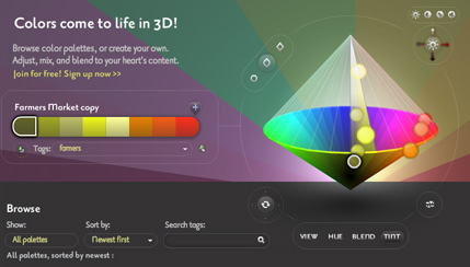
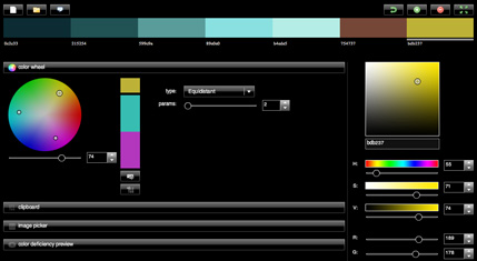
ColoRotate
As well as being a useful way to choose colors, ColoRotate looks cool and is actually fun to use. Instead of using two dimensional viewers, it presents color palettes to you in 3d and in real time.
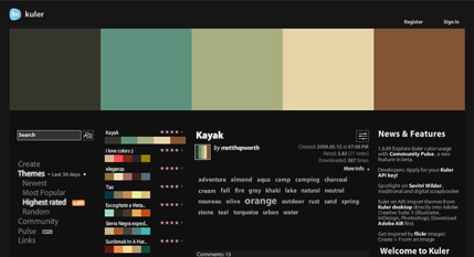
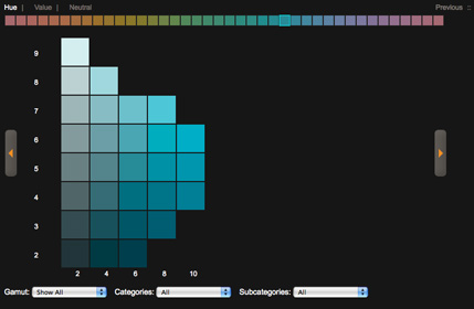
Kuler
Kuler is a community driven web app that lets your browse color palettes created by others. You can also create your own by using the color wheel, harmony rules, and color sliders.
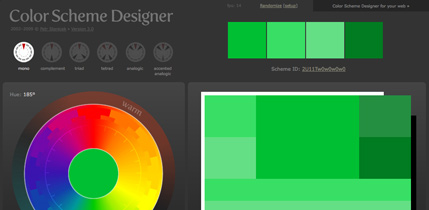
Color Scheme Designer
Color Scheme Designer has been around for a while, but was just recently updated with a brand new interface and a new color scheme generating engine.
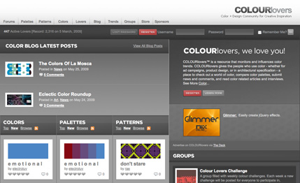
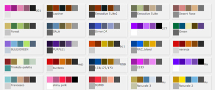
COLOURlovers
COLOURlovers provides more than just a way to find color palettes. It is also a place to network with other people to discuss color related topics, and read interesting articles about all things color.
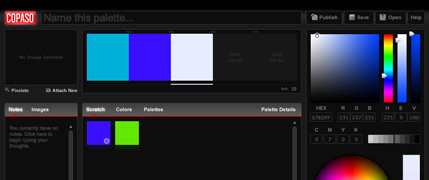
Copaso
Copaso is COLOURlovers palette generating tool. It’s rich feature set allows you to save colors to a scratch pad, extract colors from a photo, and publish a palette for thousands of other people to see.
Color Blender
Color Blender let’s you select a preferred color and then it generates a six color blend based on that color. From there you can tweak each individual color.
Toucan
Toucan allows you to select up to 20 colors for each palette either by using color association or from an uploaded image.
ColorMunki
ColorMunki gives you the ability to search colors from built in libraries and using keywords.
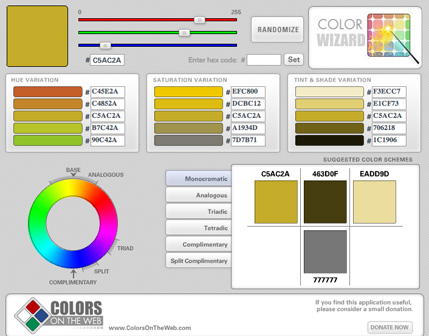
Color Wizard
With Color Wizard you can submit a base color and it generates color schemes based on your color’s complementary color, split complementary colors, analogous colors and other variations.
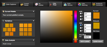
Color Explorer
Color Explorer is a fairly new color palette generating tool, but boasts a well organized set of features.
.jpg)
.jpg)
.jpg)
.jpg)


.jpg)